Javascript is disabled on your browser.
To view this site, you must enable JavaScript or upgrade to a JavaScript-capable browser.
02476 012 840
Login
Register
0
Your basket is empty
Find Your Floor
Colour
Grey
White
Lights
Naturals
Dark
Price
Up to £24.99 Per m2
£25 - £34.99 Per m2
£35 - £44.99 Per m2
£45 - £54.99 Per m2
Over £55 Per m2
Floor Type
Laminate
Vinyl
Engineered Wood
Solid Wood
Popular
Easy DIY
Waterproof Flooring
Herringbone Flooring
Premium Flooring
Real Wood
View All
Real Wood
Colour
Grey
White
Lights
Naturals
Dark
Price
Up to £39.99 Per m2
£40 - £44.99 Per m2
£45 - £49.99 Per m2
Over £50 Per m2
Floor Type
Solid
Engineered
Floor Style
Plank
Herringbone
Parquet
3 Strip
Room
Kitchen
Living Room
Dining Room
Hallway
Bedroom
Conservatory
Thickness
14mm
18mm
20mm
New
View All
Laminate
Colour
Grey
White
Lights
Naturals
Dark
Price
Up to £14.99 Per m2
£15 - £19.99 Per m2
Over £20 Per m2
Floor Style
Plank
Tile
Herringbone
Parquet
Room
Kitchen
Bathroom
Living Room
Bedroom
Dining Room
Conservatory
Hallway
Utility Room
Thickness
7mm
8mm
10mm
12mm
Brand
Aqualock
Audacity
Series Woods
Series Woods Pro
Vantage
Mega Deal
New
View All
Vinyl
Colour
Grey
White
Lights
Naturals
Dark
Price
Up to £19.99 Per m2
£20 - £24.99 Per m2
£25 - £29.99 Per m2
Over £30 Per m2
Floor Style
Plank
Tile
Herringbone
Parquet
Floor Type
Click System
Room
Kitchen
Bathroom
Living Room
Bedroom
Dining Room
Hallway
Utility Room
Conservatory
Brand
Spectra
Life
New
View All
Accessories
Accessory Type
Underlay
Installation Product
After Care
Scotia
Door Profile
Ramp Profile
End Profile
Stair Nosing
Skirting
Accessory For
Engineered
Laminate
Solid Wood
Vinyl
Room
Kitchen
Bathroom
Living Room
Bedroom
Dining Room
Hallway
Utility Room
Conservatory
View All
Clearance
Free XL samples
Home Delivery
Buy Now, Pay Later
Rated 4.6 On Trustpilot
Trade Account
Related Articles
Style Guide
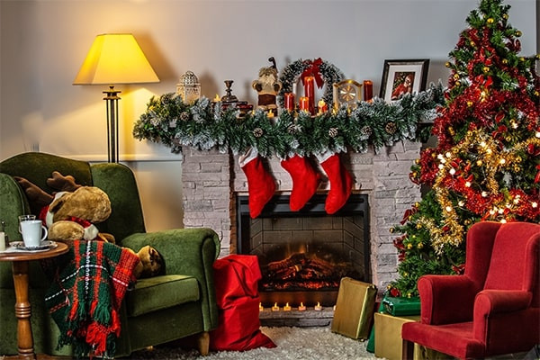
How to transform your home into a winter wonderland
Style Guide
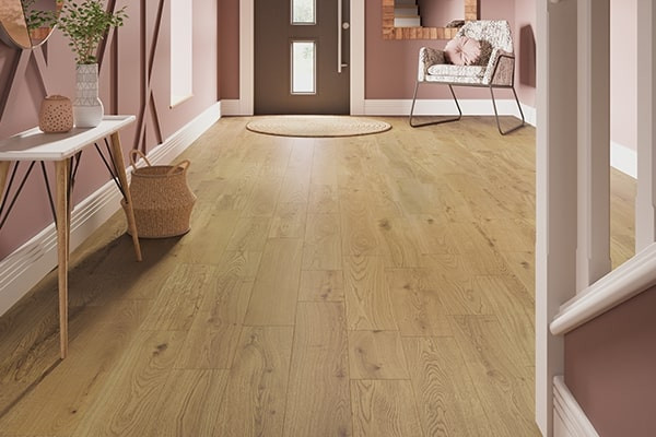
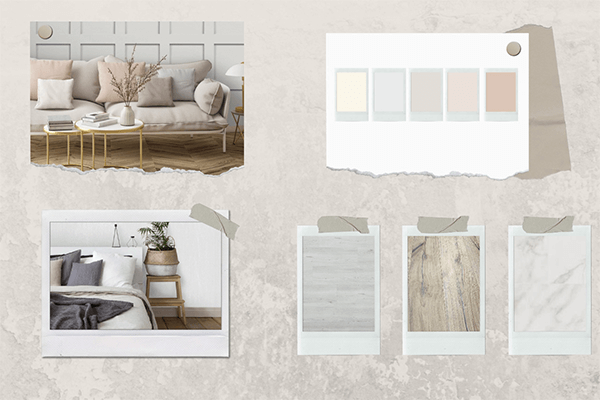
Going Au Naturel
Style Guide
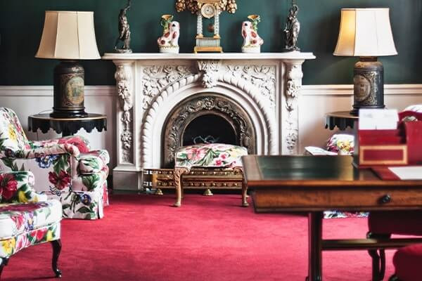
Red Carpet Looks
Trending
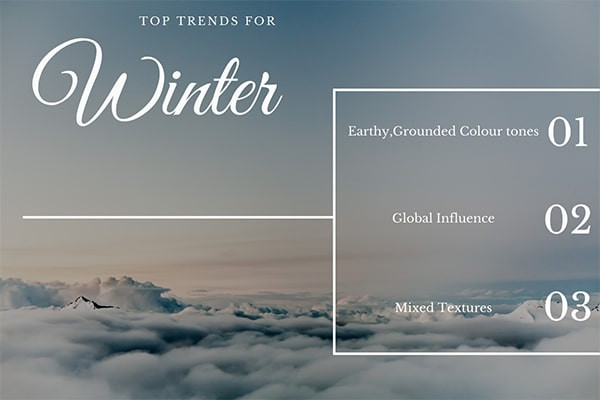
Top Trends for Winter
Style Guide
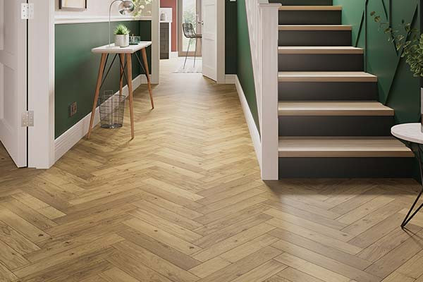
Herringbone vs chevron flooring
Trending
Trending – Neo Deco
Trending
Trending – Grandmillennial
Style Guide
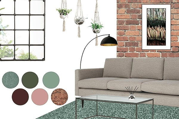
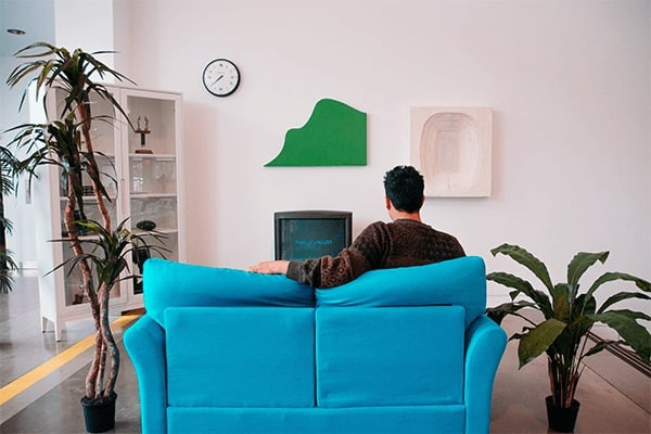
Green With Envy
Trending
Trending - Japandi
Trending
Trending – Jewel Tones
Style Guide
How To Use Colour Around Your Home
Style Guide
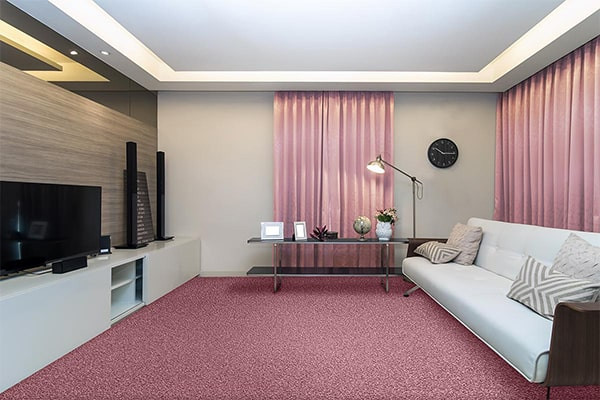
Pink: The Ultimate Anti-Neutral Colour