Trending – Jewel Tones
All that glitters does not have to be gold, as is proven by the energising colours of the Jewel Tones trend. With a palette of richly saturated hues that you are sure to adore and want to adorn, this look has long been a staple of matrimonial moments and a bright contrast used to lighten dark winters. And now, walking hand-in-hand with new trends and approaches to interior design, it’s about to step out from those shadows.
Featuring the eye-catching and dynamic colours of gemstones, the Jewel Tones trend is set to play a starring role in interior design. Read on to learn how you can make this evergreen style work for you and how to marry it up the hottest incoming trends.


All that glitters
At the heart of this trend’s palette are vibrant, gemstone-inspired hues guaranteed to punch-up your colour quotient. This radiant array has long been the perfect way to fight back the chills when the temperature drops, using its vibrant onslaught of colour to create a contrast of intensity that works especially well against neutral tones and to help liven colour schemes.
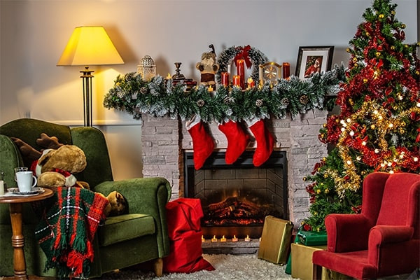
Festive-themed hues, like a rich ruby red and an effervescent emerald green, are just the tip of the iceberg when it comes to the precious colours you can pick from for this trend. Deep sapphire blue, sparkling yellow topaz, dreamy purple amethyst, and more lie beyond with this look.
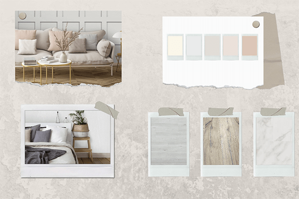
Perfecting the palette
To get this style ready to feature in your home all year round, we need to take a little inspiration from the Neo Deco style, born out the vibrant and exotic multiculturalism of Miami’s classic style of interior design.


The yellow based pastel colours of this palette work harmoniously in a single space to create that much-loved spring and summer vibe. Equally, they can be used creatively throughout your home without needing to be side-by-side for the same impact. This will lead you to some inventive colour combinations, such as bright hues on the walls that let you highlight detail elsewhere in your room with the deeper tones.
Welcoming in colour blocking
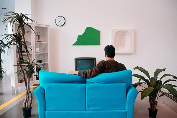
An interior design trend whose popularity is quickly rising, colour blocking adds instant impact that lets you use pops of colour and contrasting patterns to liven up any space. This doesn’t mean only having to use rich and energetic hues in your home – it’s a way of adding them in creatively to liven up bland spaces and highlight anything from ceilings to sideboards, which is why it’s a match made in heaven for Jewel Tones.


Making your home shine
Colour blocking is at its best with bold colours like those of our Jewel Tones, and with bold application in your home. Try picking out door frames, windowsills, and furniture in wild hues that form an unlikely combination with the adjacent surface, or use perspective to create contrast when looking between your rooms. For a lighter touch you could use paint to create a brilliant wall mural of geometric patterns or establish zones around the stairs or your desk.
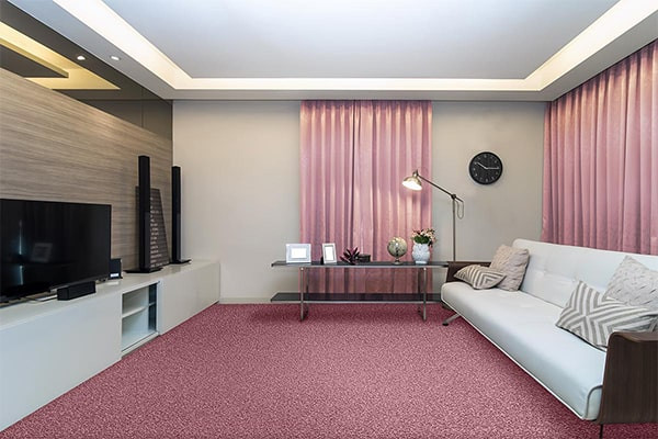
This is not the only way to introduce colour blocking – mixing and matching wallpaper works just as well as a fresh coat of paint, and you can use your soft furnishings to introduce a colour block for your jewel tone of choice and see how it plays off your walls.
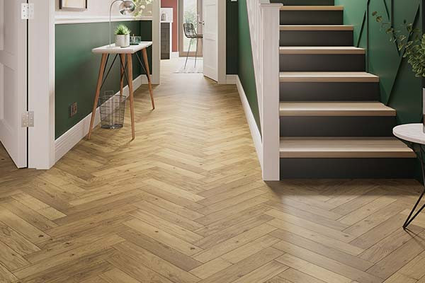
And of course, you can colour block with more than just your walls. Turn your floor into a jewelled ocean with a colourful carpet, creating a room-wide colour block for your furniture to work off. Something like the rich green of our Home Choice Cardigan Valley carpet can work just as well as the deep purple of the Home Choice Cardigan Heather.
Upcycling tired furniture not only gives it a new lease of life but helps you experiment with different colour blocking styles.


The future of Jewel Tones
Colouring blocking is a fantastic partner for Jewel Tones, and there are many upcoming trends set to make a splash in interior design that can do even more with this exquisite palette. The 70’s Retro Style, a nostalgic revival that has already become well-established in fashion, makes exquisite use of colour blocking and could effortlessly support the saturated hues used for the Jewel Tones trend.
Those same colours will work just as seamlessly in another revival, the 90’s Urban Style. This poppy, street art movement inspired style is on its way back with an even more contemporary feel, that punchy jewel tones like amethyst and topaz will support.
Lastly is the iconic retro print of Polka Dots, which always looks its best contrasted to the many bold colours of Jewel Tones we have already explored.
So, has this trend got you feeling as energised as it looks? Whether your whole home is set to be overhauled by perfectly bejewelled colour blocking, or you just want to start with some gemstone-inspired upcycling and highlighting, the Jewel Tones trend shows why it’s going to keep gaining prominence in interior design. Share your makeovers with us on our social media and use #UKFlooringDirect for your chance to be featured in our next brochure.